Klearvue Website
Designed and developed a site that showcased the beauty and the modular nature of Klearvue Cabinetry.
Scope:
Web Design
Web Development
Overview
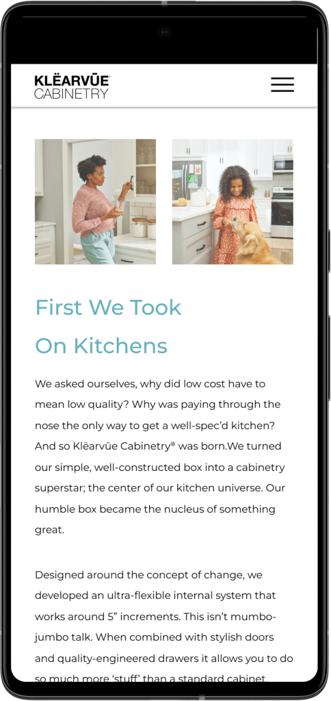
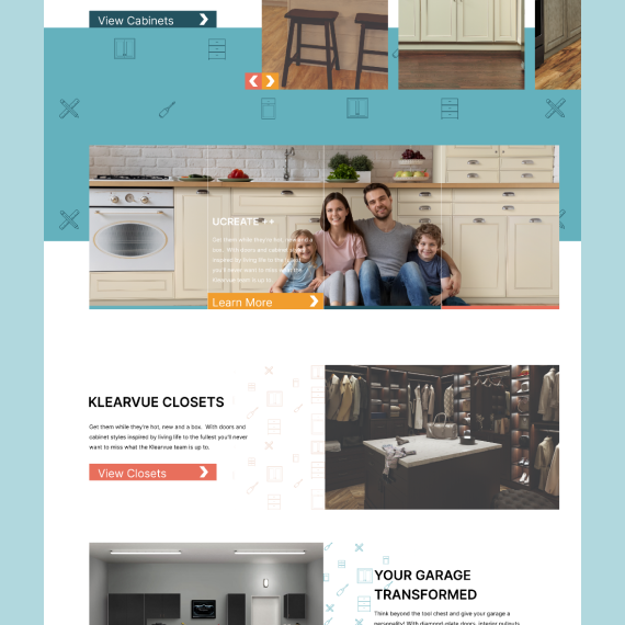
As the Klearvue brand continued to update they wanted a website that reflected their new brand standards. Starting out the goal was to create a site that would be fun and friendly to use and navigate.
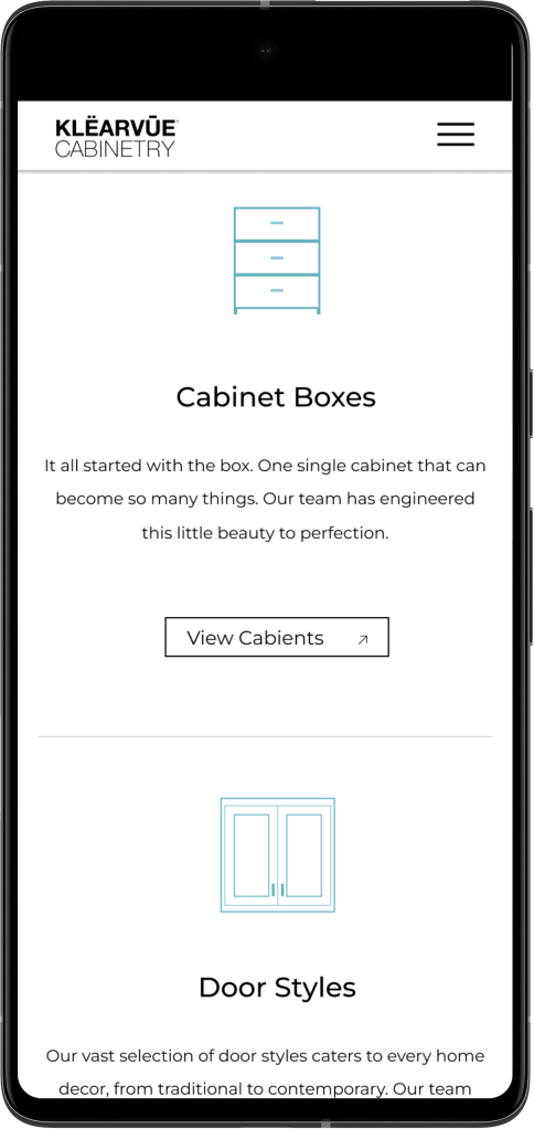
This came in the form of using bright colors alongside cabinetry related icons in a more textual way across the site. The other addition was a greater emphasis on letting the mood of their product imagery speak for the brand.
A Change in Direction
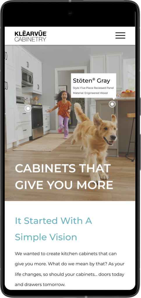
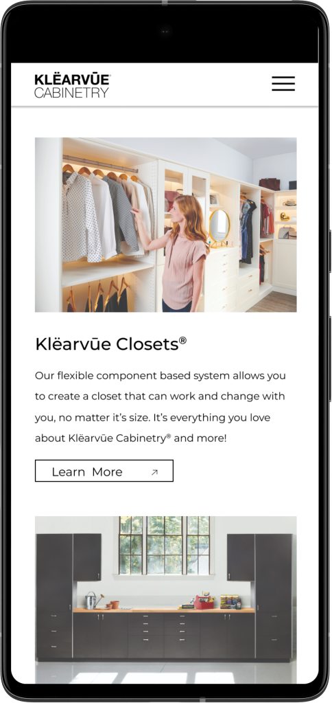
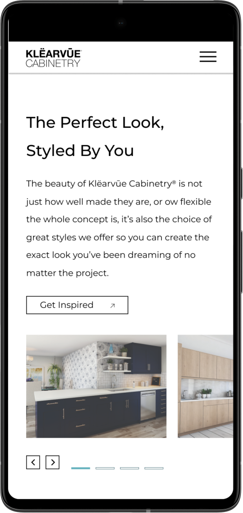
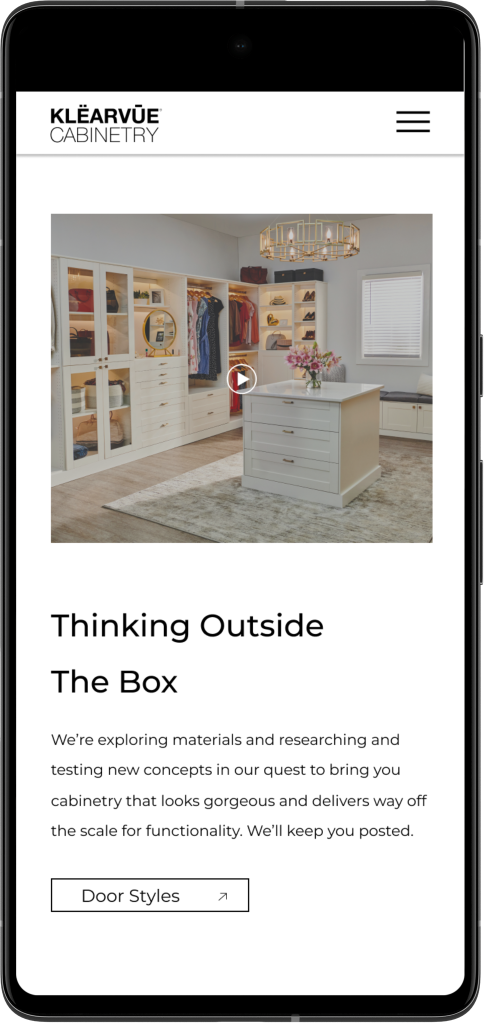
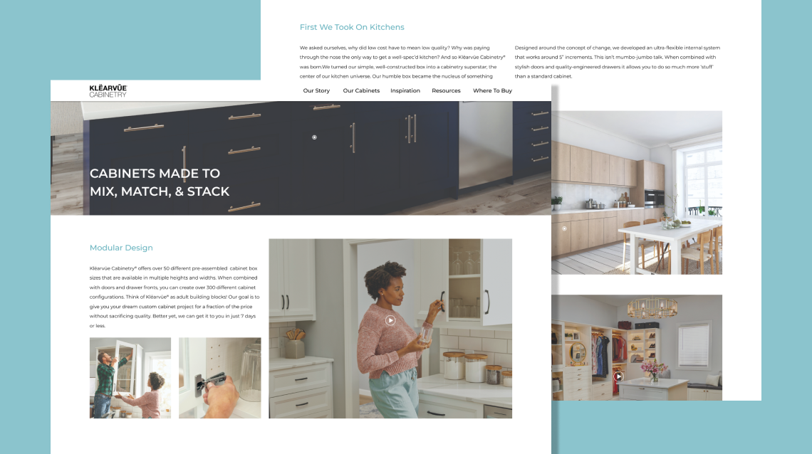
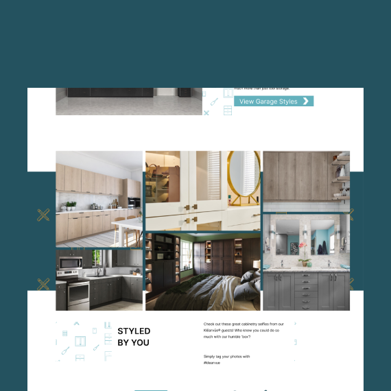
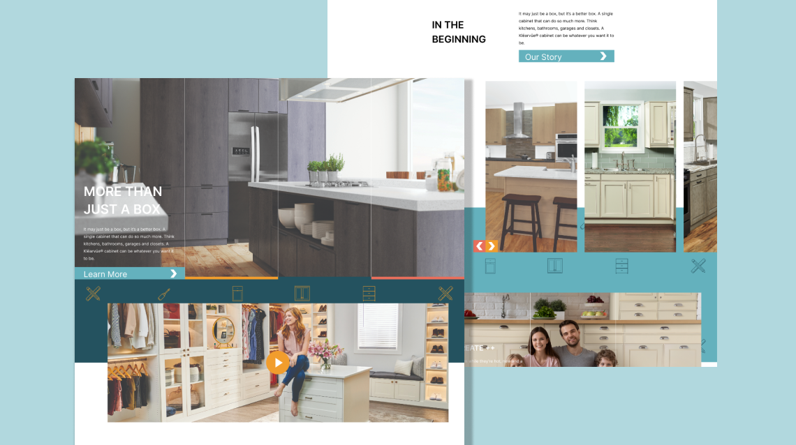
After some analyzing their target audience and seeing what others in their industry space were doing the site changed direction and put a greater emphasis on a clean grid structure and light imagery.
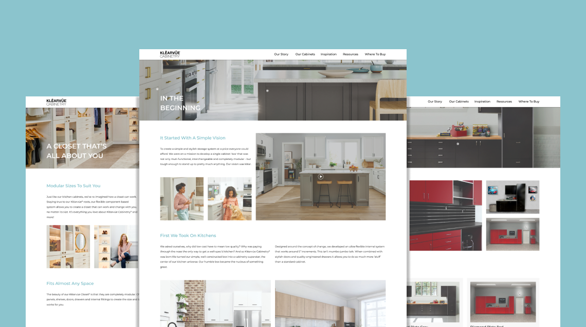
Design Process
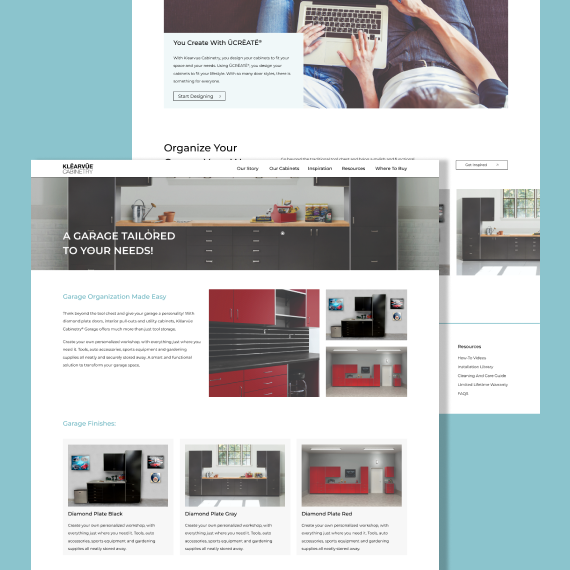
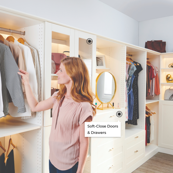
With the new approach a simple 12 column grid was used to ensure everything looked clean and orderly across the site as well as gave room for the lighter Klearvue imagery to play a bigger role in setting the mood for the user. Alongside the increased image use was a product tag. This hoverable tag would allow users to see exactly what dorr style was being featured in the images and grant them the ability to go right to that page if they were interested in learning more about it.